Your Cart is Empty
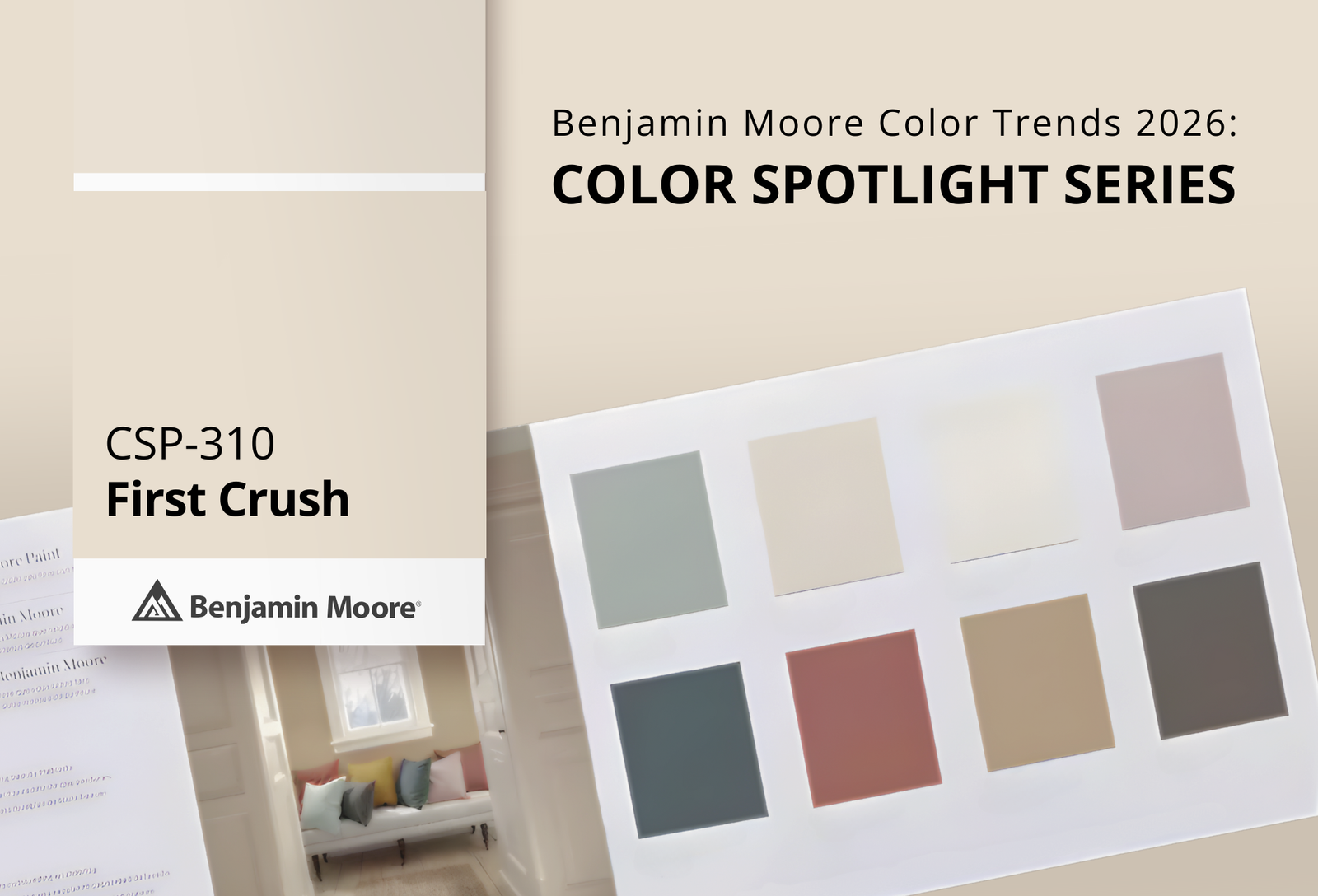

As a trusted Benjamin Moore dealer in Austin, Texas, Clement's Paint continues our Color Spotlight Series, where we explore each shade from the Benjamin Moore Color Trends 2026 palette—how they perform in real spaces, what colors pair beautifully with them, and similar hues worth sampling.
This month’s highlight is First Crush CSP‑310, an inviting and tender neutral with a soft blush undertone. Infused with just a hint of warmth, this subtle, rosy tone brings a sense of comfort and calm to interiors without feeling overtly pink or sweet.

First Crush CSP‑310 feels like a gentle whisper of color—soft, understated, and surprisingly versatile. Its blush undertone gives a subtle warmth that enhances spaces with just a touch of personality, making it a perfect choice for rooms that benefit from a hint of color without overwhelming the eye.
With a higher Light Reflectance Value (LRV), First Crush helps brighten rooms while maintaining a cozy feel. It’s particularly effective in spaces where you want a comforting, uplifting atmosphere—think bedrooms, living areas, or even smaller rooms where you want a bit of gentle depth.
Bedrooms and nurseries
Living rooms and entry spaces
Accent walls and architectural details
Hallways and transitional areas
Used thoughtfully, First Crush feels at once intentional and effortless—adding life and softness to a palette grounded by neutrals and deeper accents.
First Crush stands out in the 2026 palette because it bridges the gap between classic neutrals and more expressive tones. There’s warmth here without overt sweetness, and personality without dominance. In homes that crave a sense of serenity with character, this shade brings a nuanced softness that feels both inviting and elegant.
This rosy neutral works equally well when used as a primary wall color or as an accent to bring harmony to deeper tones or crisp whites. Across design styles—from modern to transitional to traditional— First Crush helps create spaces that feel personal, layered, and thoroughly welcoming.

According to Benjamin Moore’s coordinating suggestions for First Crush CSP‑310, these hues help balance its soft warmth and enhance its charm:

Crisp Linen CSP‑305 – A warm neutral that provides gentle contrast without harshness.

Alabaster OC‑129 – A classic, creamy white that amplifies light and openness.

Jamestown Blue HC‑148 – A calm, muted blue that adds depth and serenity.

Whipped Mocha CSP‑350 – A warm, grounded tone that pairs beautifully with blush undertones.
These pairings help First Crush feel cohesive and intentional—whether you’re creating a layered neutral palette or adding gentle contrast.
If you’re drawn to the softness of First Crush CSP‑310 but want to explore nearby alternatives or complementary tones, these colors offer a similar feel:

Sonnet AF‑55 – A soft, warm neutral with understated depth.

French Macaroon CSP‑335 – A light, comforting neutral with a hint of warmth.

Maritime White 963 – A breezy, light neutral that complements blush tones.

Ionic Column 1016 – A classic off‑white that pairs well with soft color accents.
Sampling these with Benjamin Moore color samples helps you see how each shade interacts with your lighting, flooring, and furnishings.

Choosing the right hue—especially one as subtle and expressive as First Crush—is easier when you see it in real life. As a local Benjamin Moore paint store in Austin, Texas, Clement's Paint offers expert color guidance, large color displays, and real paint samples to help you feel confident in your choice.
Visit one of our showrooms to:
View First Crush CSP‑310on large color displays
Compare it with complementary and similar Benjamin Moore hues
Pick up paint samples
Stay tuned as we continue our Benjamin Moore Color Trends 2026: Color Spotlight Series, where we dive deeper into each color from the palette and explore how to bring these shades to life in your home.
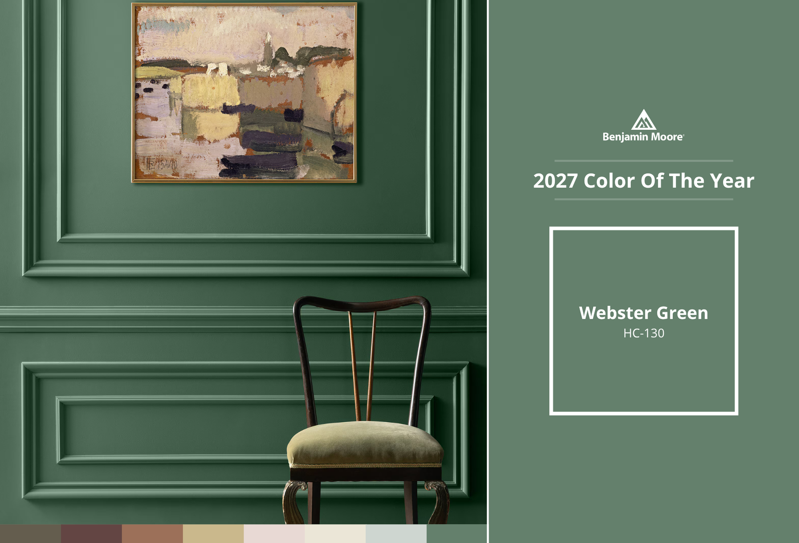

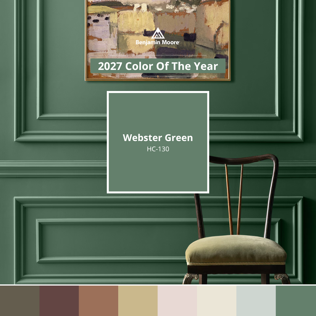
Green has always had a place in interior design. It bends with the times, showing up as sage one decade and forest the next, but it never truly disappears. When Benjamin Moore's color team narrowed down their options for 2027, green kept coming back to the table.
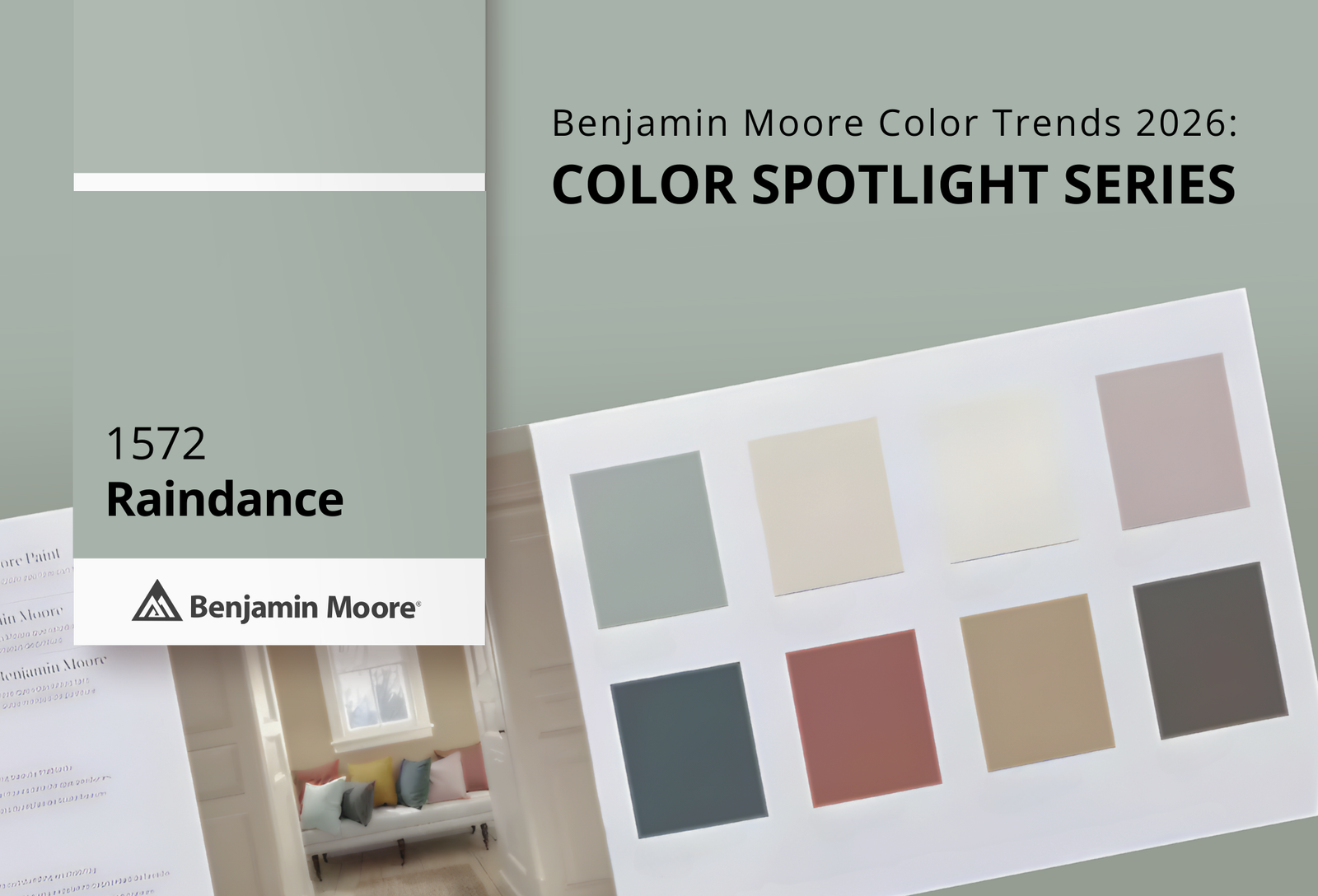

Discover Raindance 1572 from the Benjamin Moore Color Trends 2026 palette. Explore pairing ideas, similar hues, and expert color guidance from Clement's Paint, Austin, Texas
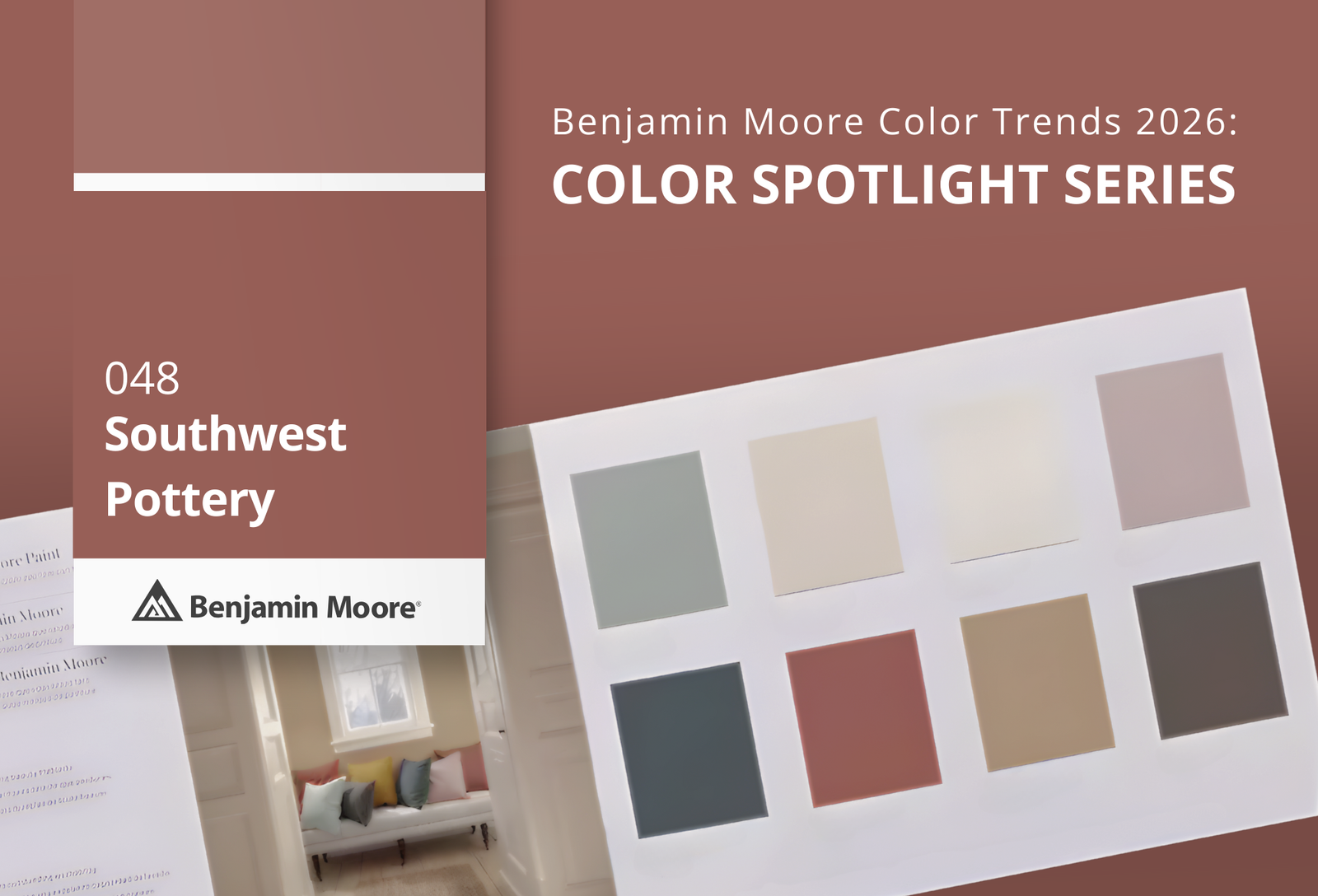

Explore Southwest Pottery 048 from the Benjamin Moore Color Trends 2026 palette. Discover pairing ideas, similar hues, and expert color guidance from Clement's Paint, your local Benjamin Moore dealer in Austin, Texas